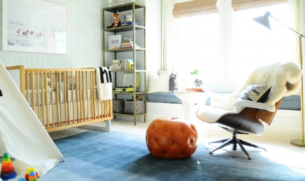
When it comes to designing a nursery, many parents opt for modern, sleek styles. But why not consider bringing some vintage cool to your baby’s space with mid century modern design?
Timeless Appeal
Mid century modern design originated in the 1950s and 60s, and its clean lines, organic shapes, and minimalist aesthetic have remained popular ever since. This timeless appeal makes it a perfect choice for a nursery that you want to grow with your child.
Iconic Furniture
One of the key elements of mid century modern design is its iconic furniture pieces. Think Eames lounge chairs, saucer lamps, and sleek, teak credenzas. These pieces can add a touch of sophistication and style to your nursery, while also being functional and practical for everyday use.
Bold Colors and Geometric Patterns
Mid century modern design often incorporates bold colors and geometric patterns. Consider adding a pop of color with a bright orange rug or a geometric wallpaper accent wall. These design elements can add visual interest to your nursery and create a playful, stimulating environment for your baby.
Mixing Old and New
Don’t be afraid to mix old and new in your nursery design. Blend vintage mid century modern furniture with modern accents and decor to create a stylish and eclectic space. This mix of styles can add depth and personality to your nursery, making it a unique and special place for your baby.
Bringing vintage cool to the nursery with mid century modern design is a trend that is sure to stand the test of time. Embrace the clean lines, bold colors, and iconic furniture pieces of this design style to create a beautiful and stylish space for your little one to grow and thrive in.

